Hot Colors of the Year for 2016
While almost any color goes in New York homes today, it’s always fun to keep a pulse on those that are trending. From Rose Quartz to Serenity to Simply White, these are the hot colors of the year for 2016.
While almost any color goes in a New York home today, it’s always fun to keep a pulse on those that are trending. Here are the hot colors of the year for 2016.
Wonderful White
While white hardly seems trendy, after years of painting our walls a wide array of colors, all white rooms feels fresh. Benjamin Moore even named Simply White, a clean, crisp, multipurpose shade, it’s color of the year for 2016.
The best thing about white is that it literally goes with anything! White provides a blank canvas for other colors, so feel free to experiment with your favorite combinations. For a fun look, pair white walls and neutral furnishings with bold, colorful accessories. For a more relaxing room, partner white with other neutrals.

Image Source: Flickr/Scott Lewis
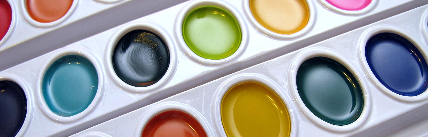
Peaceful Pastels
After a long, hectic day, most New Yorkers want to return home to a relaxing apartment. Soft pastel colors are naturally soothing; they’re the perfect antidote to the busy world around us.
Two pastels that we’ll see a lot of are Pantone’s 2016 Colors of the Year, Rose Quartz, a pale, dusty pink, and Serenity, an airy blue. These calm, relaxing shades work beautifully with each other, as well as a wide range of other colors. Pantone recommends pairing them with other mid-tones including greens and purples, rich browns, and all shades of yellow and pink, or adding in silver or hot brights for splash and sparkle.
Other pale colors you’ll this year are lilac and soft, milky blues.
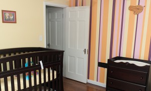
Not So Basic Neutrals
When it comes to colors of the year, neutrals are holding strong. While always popular in home decor, it’s how you use neutrals that makes them modern.
Adding bold pops of color to your home can be enticing, but neutral rooms feel classic, yet modern at the same time. Think beyond all white, cream, or gray and introduce soft colors, like those pastels we mentioned earlier, into the mix. These colors will add interest to a neutral room even without the bold colors.

Image Source: Flickr/Emily May
Graphic Grays
Gray is a classic when it comes to home decor, but most shades we’ve seen have been on the pale side. This year, think about introducing darker grays, like charcoal, into your home.
Dark gray walls would make a statement in any room. Pair them with lighter furniture and colorful accessories for a room that truly has character. If you’re not ready to commit to dark gray on your walls, furniture and accessories are great options.
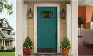
Bold Blues
Introduce drama into your home with deep, dark blues.
Darker blues, like navy and deep teal, feel new, especially when compared with blues that have been popular for a while, like turquoise. Navy and dark teal pair beautifully with many colors, including gray, whites, and other neutrals.
Paint your walls one of these bold shades, and you’ve instantly introduced drama into your home. These colors also work beautifully in furnishings and accessories, if dark walls aren’t your thing.

Image Source: Flickr/denise carrasco
Update your New York home in 2016 with one of these colors of the year!
Main Image Source: Flickr/frankieleon
[cf]skyword_tracking_tag[/cf]