Living Room Colors That Bring Summer into Your Philadelphia Home
Banish winter and welcome summer to your Philadelphia home by adding some color. Trending living room colors in the area include a vibrant shade of purple, as well as warm and welcoming shades of gray.
Summer in Philadelphia means it’s time to freshen up your interior decor. As the sun gets brighter and the days get longer, a new color scheme can make your home really shine — whether you repaint your living room walls or simply add some color with a few new throw pillows. We’ve spotted a few living room colors that are on trend in Philadelphia this summer. Check out some of the shades that are popping up in living rooms across the city.
Going Nautical
If you can’t escape to the Jersey Shore for a weekend, going the nautical route with your living room colors offers the next best thing. Light blue, seafoam, navy blue, and white all recall the ocean and seaside, bringing a relaxing feel to your living room. Over in Rittenhouse, interior designer Luna Grey brightened up a client’s living room by trading the outdated furniture for a navy blue and white couch and a white recliner. The result is a relaxed yet sophisticated living space.
Behr Paints have also identified nautical hues as a trend for 2014, creating a five-color palette dubbed “Seaside Harmony.” Add a summery pop of color to your Philadelphia living room with Behr’s Ocean Liner, a shade of light blue with hints of green. If you aren’t ready to go full blue on the walls, use Ocean Liner (or a similar paint color) as an accent on the baseboards or trim.
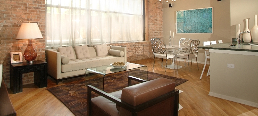
A Bit of Gray
Shades of gray are also popular in Philly home decor this year. According to CBS Philly, this year’s popular grays are earth-toned, warmer and more inviting than traditional grays. A light gray or “greige” color is a great neutral alternative to white or off-white walls, giving walls interest without overwhelming or overpowering the living area. Designer Luna Grey ended up painting her client’s walls greige to give the space a more peaceful look.
Radiant Orchid
Dubbed “Color of the Year” by Pantone, Radiant Orchid (a vivid blend of pink and purple) is the must-have decorating color of 2014. Pantone describes the hue as “an expressive, creative, and embracing purple — one that draws you in with its beguiling charm.” And since it’s bright and welcoming, it’s perfect for summer decorating.
While you can go all out and paint the walls of your living room Radiant Orchid or a similar shade of purple, there are other ways to make use of the color without as much commitment. Look for accent pieces that feature it, such as throw pillows, a glass vase, or even a throw blanket. Or you can try adding a piece of furniture in the color. IKEA has some affordable pieces in purple, such as the Kivek chaise.

Image Source: Flickr
Summer is all about warming up. Whether you add nautical-inspired shades of blue, welcoming grays, or brilliant purple to your living room, you’ll be giving it a dose of warmth that will last you through the season and into the colder months.
[cf]skyword_tracking_tag[/cf]