How to Make a Grey Color Palette Work for Your Home
Interior Designer John Douglas Eason shows us how shades of grey can be anything but dull.
Guest post by interior designer John Douglas Eason.
Long before the hair on my head turned silver-grey, even before my wardrobe evolved towards similar hues, I realized that my favorite rooms were almost always in shades of grey. Tonal grey rooms are among the most dramatic and glamorous rooms in which to reside.
To my eye a grey room is timeless, but at this moment is it also quite on trend. Chances are that a glance through a current design magazine or book will turn up a moody grey room or two. Compared to their more colorful counterparts they are as easy on the camera as they are on the eyes.
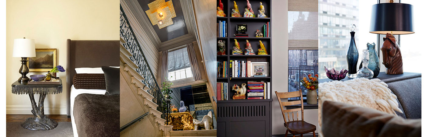
Flecked with taupe, brown or a shot of black, a grey room exudes a sense of quiet sophistication. And yet, a grey room needn’t feel as though it is lodged in a somnambulist state of dreary haze; they are fantastically receptive to doses of pink, purple, yellow or turquoise. A pale grey room with bright yellow accents can feel as fresh as spring. A pop of shiny gold against a grey backdrop is anything but dull.

My own very gentlemanly grey living room, with its large windows onto the steely New York skyline, incorporates purple mid-century Blenko glass to lively effect as an accent on a console. I also used purple accents in a smoky grey bedroom – pulling the color out of a Hudson River school landscape painting above the bedside table. In another client’s guest bedroom I selected pale grey for the walls and deep Down Pipe grey by Farrow & Ball for the cabinets and trim. This very serious backdrop became the perfect foil for the client’s collection of multi-colored antique carnival prizes.


Color, however, is by no means required to make a grey room a success. For the annual Kips Bay Show House I lacquered the ceiling of a twenty-five foot high stairwell of a Romanesque mansion with Benjamin Moore’s classic Gray and then suspended a cloud-like gold Ingo Maurer chandelier to give a sexy update to the staid McKim, Mead and White building. I covered the walls with a hand painted horizontal stripe of metallic silver, platinum, pearl and gold. Grey anchors and enhances the otherwise glitzy metallic colors.

In my years of favoring it I have learned that much like white, grey is a ‘color’ with many subtle personalities. Grey can be warm or cool, it can have hints of red or blue, it can be dark or light. Yet as it reads easily as neutral it can accommodate the companionship of color, either by toning it down or providing a dramatic contrast. I value it for its magical versatility and sophistication and I hope I’ve inspired you to consider how it might work in your own home.
John Douglas Eason is a New York based interior designer with more than twenty years experience decorating homes in New York City and its surrounding communities. His sophisticated urban sensibility is tempered by his foundational years working in Greenwich Connecticut’s grand homes. From Manhattan pied-à-terre’s to country estates as far-flung as Texas, John’s serene and smoky interiors are curated for the cultured but also built for living.
Victoria Keichinger
Victoria Keichinger is the Vice President, Brand Marketing for Coldwell Banker Real Estate. When she's not managing national media and advertising for the Coldwell Banker brand at work, she finds herself most at home in Jersey City, NJ with her pre-school crush turned spouse and son. A true Francophile, she loves to travel and will go anywhere there are ski slopes.


6 Comments
How to Make a Grey Color Palette Work for Your Home | Janet Glowacki's Blog
September 18, 2014[…] post How to Make a Grey Color Palette Work for Your Home appeared first on Coldwell Banker Blue […]
How to Make a Grey Color Palette Work for Your Home | My Website
September 18, 2014[…] How to Make a Grey Color Palette Work for Your Home […]
Carl Lana
September 19, 2014As an interior designer myself, I have always gravitated to the sophisticated and highly versatile color spectrum that grey offers. Great post John!
How to Make a Grey Color Palette Work for Your Home | Elouise Margita's Blog
September 19, 2014[…] John Douglas Eason is a New York based interior designer with more than twenty years experience decorating homes in New York City and its surrounding communities. His …read more […]
How to Make a Grey Color Palette Work for Your Home | Patrick Lim's Blog
September 19, 2014[…] post How to Make a Grey Color Palette Work for Your Home appeared first on Coldwell Banker Blue […]
Social Post
September 23, 2014[…] http://blog.coldwellbanker.com/make-grey-color-palette-work-home/?utm_source=rss&utm_medium=rss… […]