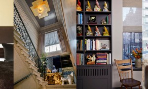
Striking a delicate balance in your home’s decor between relaxed sophistication and engaging pops of color can be a challenge to say the least. Go a little too color happy and it will look like your children decorated your home while you were at work; stray a little too on the conservative side and you might end up with a sterile look more reminiscent of a hospital than a home.
If you want to create a warm and sophisticated atmosphere in your home, but also love some edge with color, LXTV Open House asked New Jersey based interior designer Uma Stewart to give a few extremely simple tips on how to achieve balance.
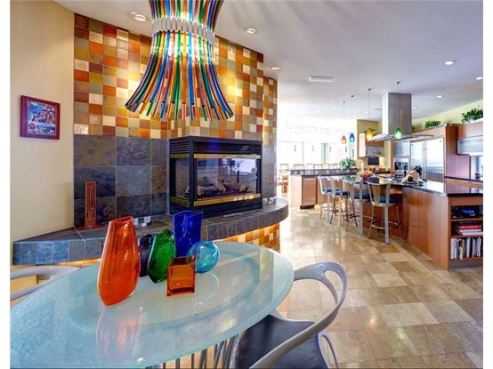
Living Rooms: If you’re into sophisticated, formal and comfortable living rooms, Uma Stewart suggests going with muted colors like grey and beige. The trick is to select muted colors with colorful undertones. In the video from LXTV Open House, she chose undertones of blue and orange which you can support by purchasing art and accessories in those colors.
Dining Rooms: For the most part, dining rooms should be a little more sophisticated and formal. Stewart recommends a white space but color can be easily added with simple anchoring accessories like a colorful table runner. You can support that pop of color withtable settings like silverware and napkin rings.
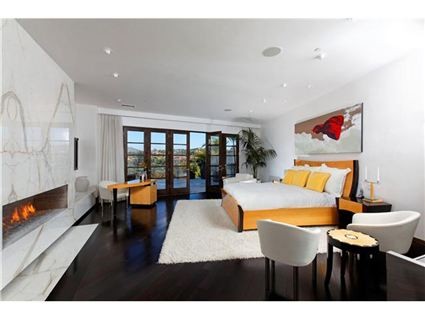
Master Bedrooms: In the client’s home that designer Uma Stewart shows us, she aimed to create a luxurious oasis for them; and don’t we all want that? Her plan of attack was to choose a natural color that “blends well wit neutrals but gives the eye something to look at.”
Master Bathrooms: Contrast is always nice but remember that it shouldn’t deviate from the decor of the master bedroom. Uma went with pale green in the bedroom so she used pale green in the bathroom but complimented it with rich dark browns to give the bathroom a nice contrast look. Soft muted colors like pale green in bathrooms also give off that spa like feel
So to recap, Uma Stewart’s top 3 tips on how to decorate with color without overpowering the design aesthetic of your home are:
1. Stick with bright pops of color on your artwork and accessories
2. Opt for muted colors on your furnishings
3. Pale washes of color on the wall work well. Even textured looks spice things up a bit.