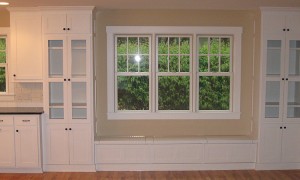
While a bit of color in your home can make it feel exciting and unique, going too far and having too many bright and colorful decorations can overwhelm your space, giving it a frantic energy. When picking interior color schemes for your Philadelphia home, it’s important to remember a few rules. First, it helps to understand how colors work together. Once you understand how colors work together, the next step is figuring out how to balance them. Adding color to your home also involves picking and choosing decorations and furniture carefully.
Get Familiar with the Color Wheel
A color wheel can be a useful tool when you’re picking out interior color schemes for your home. The wheel usually contains 12 hues, arranged in a particular order. For example, since red and blue combined make violet or purple, the order of the color wheel goes red, red-violet, violet, blue-violet, blue. Usually, the wheel can be split into two halves: warm and cool. Warm colors usually contain a fair amount of red, while cool colors contain a lot of blue. Orange and red-violet are warm colors, while blue-green and violet tend to be cool colors.
Colors located next to each other on the wheel are known as analogous colors. Red, red-violet, and violet are analogous, for example. Picking an analogous color scheme for your interior design is one way to create a balanced, harmonious look in a room, while still allowing you the chance to add a burst of color or brightness.
Tone and saturation are also important when picking out colors. A saturated yellow will be bright and vivid, but if a yellow hue has more gray in it, the tone of the color changes — it becomes less saturated and more muted, making it more neutral.
Remember the 80/20 Rule
Once you’ve mastered the basics of color theory, one rule that can help you make use of it in your home is the 80/20 rule. The premise of the rule is simple: Use neutral colors for 80 percent of the decor and a bright and bold color for the remaining 20 percent of the decor. If you’re using an analogous color scheme with shades of blue and purple, a gray-toned blue might be ideal for the walls, while a vivid violet couch or armchair can add just the pop of color you need.
Pick One Feature to Highlight
A simple way to put the 80/20 rule to use in your home is to choose one feature to accent or focus on. For example, you might decide that you want your seating to be brightly colored and choose a hot-pink sofa or a fire-engine-red chaise. You can also pick smaller accents if you’re extra cautious about color. For example, adding brightly colored pillows to a neutral couch is a commitment-free way to add a bold look to your home. If you decide you don’t like the brightness, you can easily trade the pillows for a neutral-colored set.
While you can find ways to bring bright and bold colors home without overdoing it, if you still feel stuck, another option is to work with a color consultant or decorator in the Philadelphia area. A consultant can help you pick out colors that work with your style and that don’t overwhelm your home. Whether you do it on your own or work with a pro, you can add color — and go bold without going overboard.
Image Source: Flickr
[cf]skyword_tracking_tag[/cf]


[…] post Go Bold: Interior Color Schemes for Your Philly Home appeared first on Coldwell Banker Blue […]
[…] ← Go Bold: Interior Color Schemes for Your Philly Home […]
[…] Go Bold: Interior Color Schemes for Your Philly Home […]
[…] post Go Bold: Interior Color Schemes for Your Philly Home appeared first on Coldwell Banker Blue […]
[…] While you can find ways to bring …read more […]
[…] While you can find ways to bring …read more […]
[…] post Go Bold: Interior Color Schemes for Your Philly Home appeared first on Coldwell Banker Blue […]