Guest post by Michelle Lee, Houzz
As city living often goes, people are paying more money for less space. Studio apartments are becoming the norm and many renters are losing the luxury of having a private bedroom or separate living room. This small spacing living phenomenon has grown beyond rentals and is influencing a rising trend of tiny houses in rural areas as well. With less space, homeowners and renters are getting creative on maximizing every inch to live comfortably. Read on for five space-saving tricks you may want to try in your home.
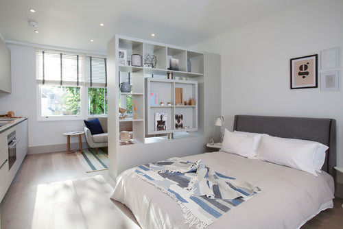
Use a divider. Having all of your furniture and belongings out in the open can immediately look messy and overwhelming. A quick and easy solution to separate space is to divide the bed and a common seating area. There are plenty of temporary and low-maintenance options available for renters, such as floor-to-ceiling fabric drapes and folding room dividers. You can also position a sizable bookcase as a barrier with some storage space. For homeowners, consider installing sliding barn doors.
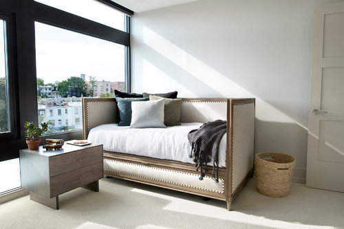
Utilize multifunctional furniture. The classic example here would be a fold-up Murphy bed that works double duty as a bed (typically with built-in storage) and a flat wall. Alternatively, you could use a daybed or sofa bed, which both work great as a general seating area during the day and a comfy bed at night.
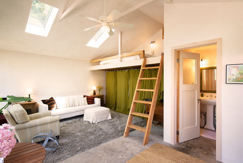
Look up. Major city apartments strapped for space are promoting loft areas as extra living space in small rentals. Depending on the size of the loft, you can make a mini lounge area or even a small workspace out of the empty space below. If you don’t have a built-in loft, but your apartment has high enough ceilings, consider a loft bed for the same space-saving benefits.
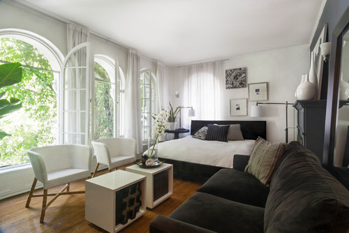
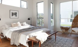
Make the bed your focal point. Replicate the luxe look of hotel suites by putting the bed front and center and designing the rest of your living room around it. Contrary to popular belief, oversized furniture has been shown to work well in small spaces when used sparingly and strategically. Intentionally making your bed the centerpiece of a room will do just the trick.
Stick to one theme. A disjointed design can visually shrink space even more. It’s crucial to unify each part of your space with one theme, color or style. This can be a monochromatic minimalist look, a playfully eclectic vibe or somewhere in-between. Just make sure to keep the palette or theme consistent throughout your entire space to ensure a cohesive, put-together look.
Related Links





Loved all the three pictures Sharon, but if I had to choose among the three, I would go for the divider, as it looks much better, gives me privacy and large space at will.
These are good ideas you’ve provided. I hope to get started with my home-remodeling in the near future or just started doing something each and every day until I get to the finished product.