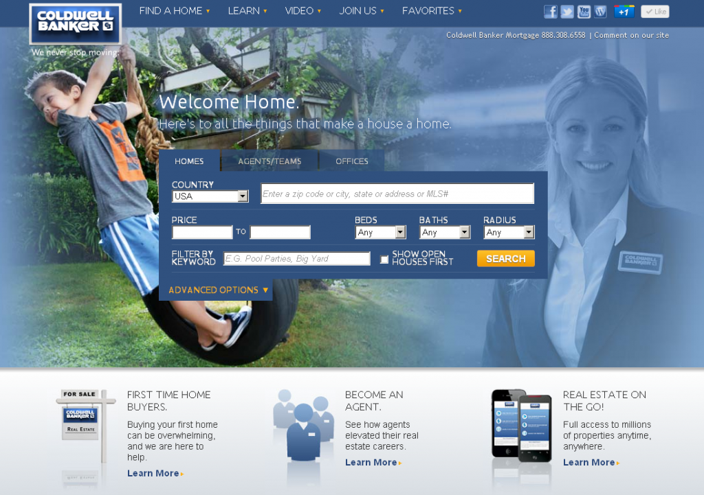
Today we released a new look for our award winning website, coldwellbanker.com. The home pages has been updated with a much warmer and home-related look than we’ve ever had before. When you visit coldwellbanker.com you’ll notice that when you click on the home search tab or the agent tab the visuals in the background highlight what it is you’re searching for. We’ve also simplified the menu options, updated our highlighted sections and added a few other touches here and there.
It’s kind of like we repainted our entryway, installed some brass hardware to the front door and added a few nice accents from Crate & Barrel to brighten up our main foyer.
This is just the first of a number of changes coming from Coldwell Banker Real Estate in the coming months. Coming in March we’ll unveil what we believe is a significant and timely change in the real estate conversation. More to come, but for now we hope you enjoy this new design for coldwellbanker.com as you look to buy, sell or just dream about that new home.
Here’s to all the things that make a house a home.


Love the new layout! Looks fantastic and user friendly!